So much can be achieved in the world of interior design through the selection of colour. It can brighten up a gloomy room, create an accent or add a bit of warmth to an environment that would otherwise look sterile.
Colour trends change all the time, some becoming fashionable and others going into oblivion. What will the colours of 2020 be?
Pantone has already announced its colour of the year but many other authorities and trend setters have their say on the most prominent tones of 2020. If you’re looking forward to redecorating your home and making it more cheerful/sophisticated/modern, you may want to explore the following colour options.
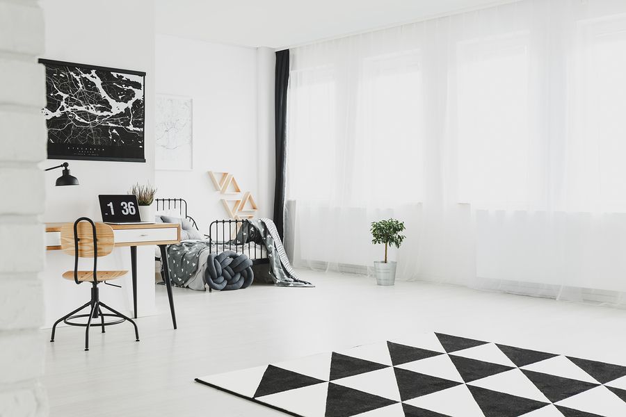
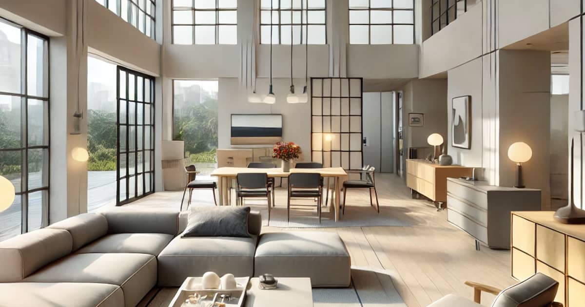
According to Elle Décor, black and white will be one of the most prominent colour schemes of 2020.
There are several reasons why a black and white combo will never go out of fashion.
For a start, these two tones allow for very dramatic contrast to be executed. At the same time, the tones are bright and noticeable, working together to bring a degree of sophistication to just about every living or professional space.
You have dozens of choices when it comes to black and white home renovation projects.
Black and white tiles are a great option for making the hallway more visually engaging. You can opt for very dark, ebony-like wooden cabinets contrasted by a white table and chair set. The same goes for a black marble kitchen countertop and a completely white backsplash crafted out of miniature, sparkly tiles.
You can also play around with texture and feel to enhance the black and white combination. Glossy or matte, textured or completely smooth – it’s really up to you to find out the finish that will exude the specific style you have in mind.
Good Housekeeping has labelled this pinkish tones as one of the interior design must-haves of 2020.
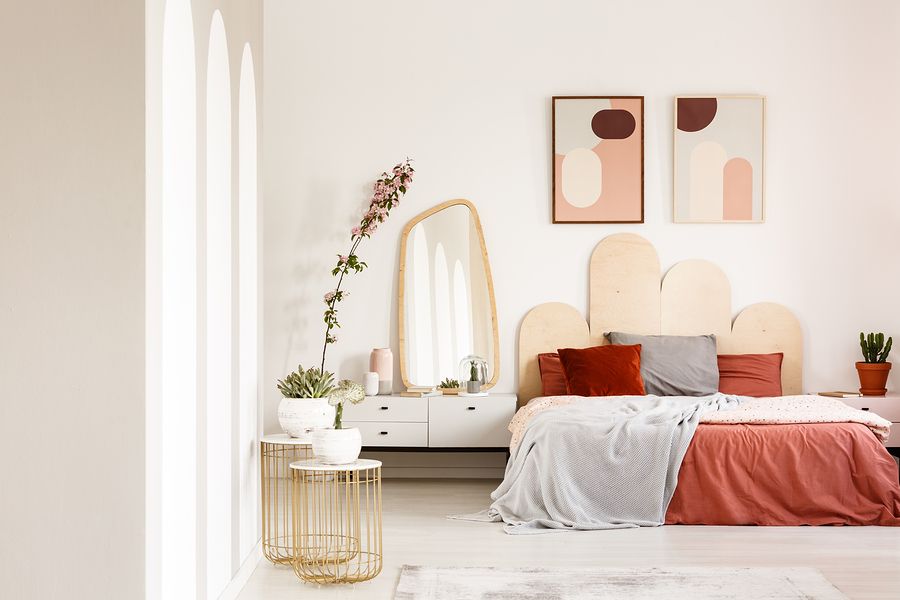
Blush is a gentle, soft pink and as you’ve probably guessed already, it derives its name from the makeup that ladies use to give their cheeks a bit of colour. It’s not as striking and bold as other pink hues, which means it adds warmth and a bit of playfulness without going overboard.
When mixed with several other warm tones, blush will look really modern and inviting. It can also work with neutrals or metallics to make the final result a bit more visually dazzling and stunning.
A blush interior design concept can be carried out by repainting a room, adding the right accessories (a blush-coloured throw rug and pillows) or by changing the natural note of wooden elements like shelves and cabinetry.
It seems that 2020 would be the year of classics and here’s another one to consider if you want your home’s interior to look really elevated.
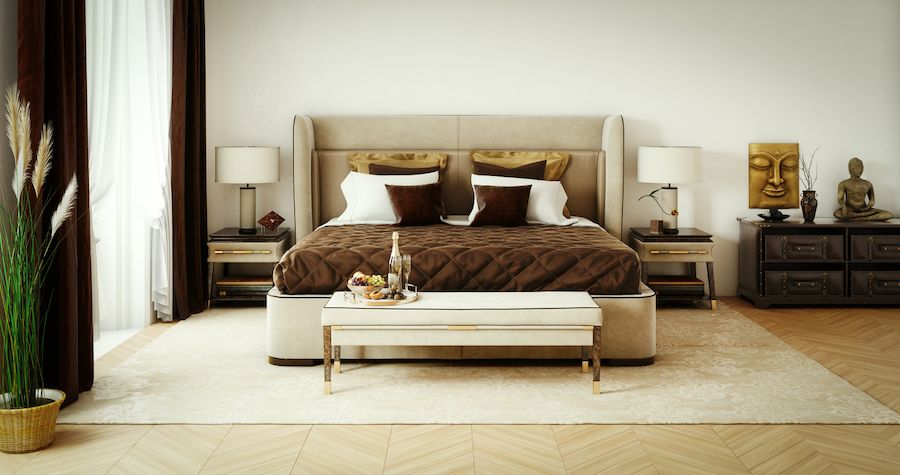
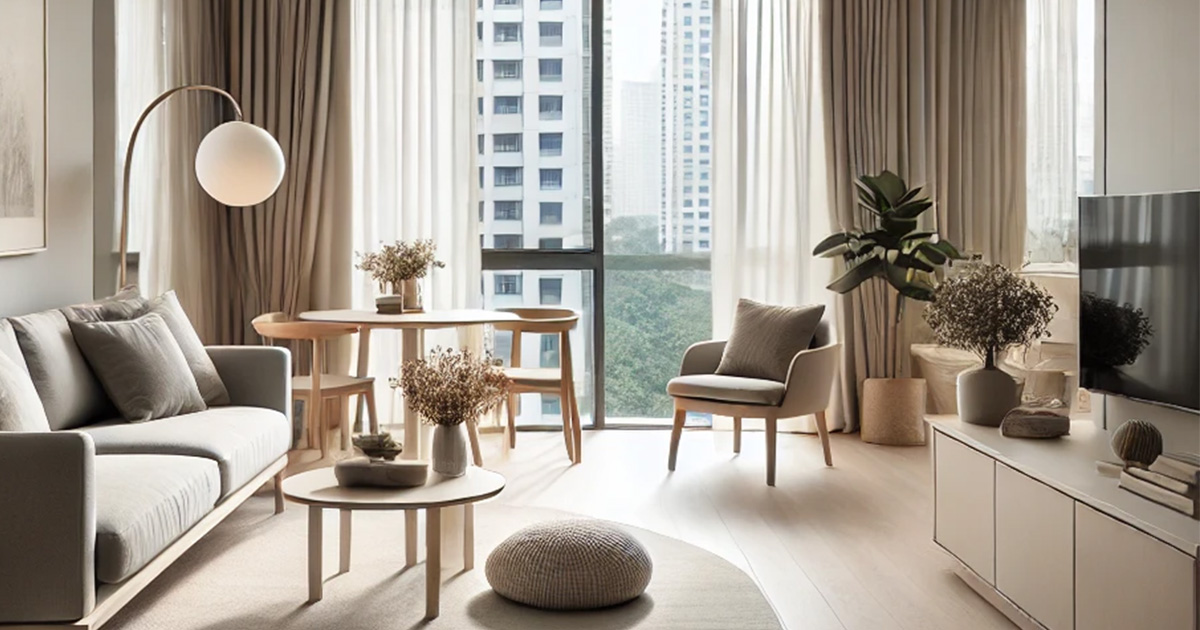
Champagne is seen by some as a relatively boring colour but this doesn’t have to be the case.
Interior design professionals in Singapore predict that champagne will come to replace cold neutrals in 2020. There’s a simple reason why its prominence will grow. Champagne is a gentle colour but it still adds a bit of warmth and excitement to a room.
Because champagne itself is relatively gentle, it can be paired with bold prints, patterns and textures. The tone carries such decorative elements very well, resulting in visual solutions that look much more engaging and exciting than the individual parts on their own.
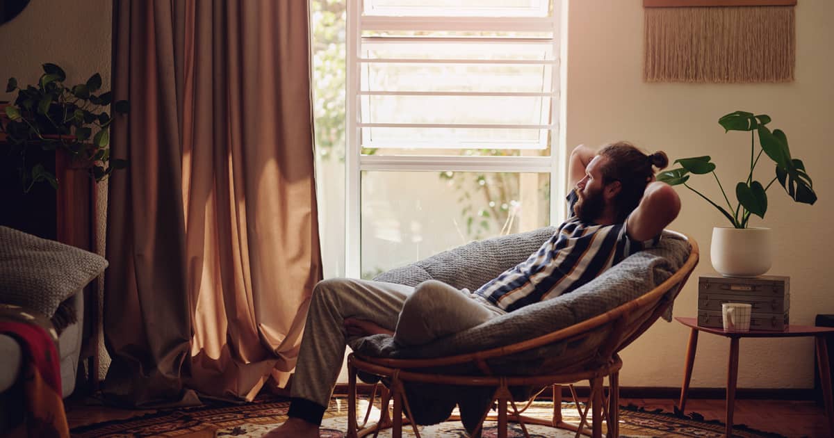
If you want a very cheerful colour that still looks somewhat sophisticated rather than juvenile, rusty orange would be the way to go.
Rusty orange is a bit more reddish than its classic counterpart and it’s also sometimes called burnt orange. It is an ideal choice for accents and artwork that will be the star of the interior design show in the respective room.
The key here is to use rusty orange in moderation because it’s very bold and outstanding. As a result, the tone can quickly steal attention away from other important elements in the room.
You can feature rusty orange trimmings or a modern standing lamp in the corner. A mirror frame in the colour will also be a great focal point. Some have even gone ahead to make the front door rusty orange, showing something different and original even before someone has entered the house.
Are you looking for an alternative to all of the warm tones mentioned so far in the guide? We may have a good alternative for you.
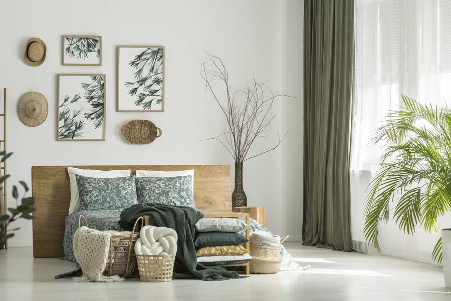
As a Singapore interior design company, we love working with this colour because it has its distinctive personality. It’s also natural and gentle, which means it can work in a palette alongside other similar or contrasting tones.
Olive green dominated Milan Design Week in 2019. Industry representatives believe that the popularity of the colour will continue being high in 2020.
This colour carries a distinctive vibe but at the same time, it’s not overpowering. Thus, you can cover a large surface area in olive green without turning the room into a large eye sore. The tone is an ideal choice for the living room and it can also work in the bedroom or the kitchen.
Olive green works well with gold, other naturals and neutrals. The colour exudes serenity and it will contribute to a harmonious outcome.
Have you chosen a new colour for your home renovation project?
Or are you finding it difficult to make up your mind?
Home Guide can help you pinpoint the one tone or colour palette that will give you the remodelling you’ve envisioned in your head. Contact us today to get the process started.
