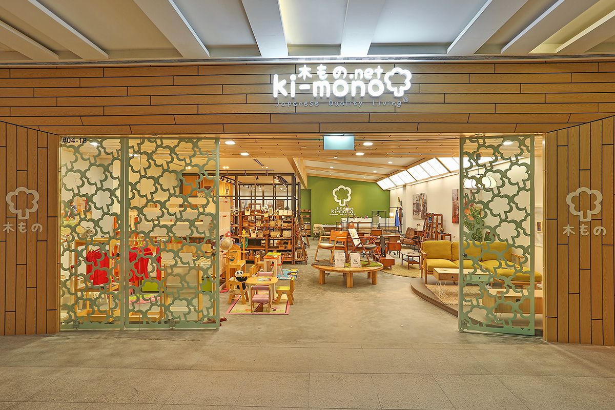
The initial floor plan of the store was too open, with no clearly defined shop front. Customers could access the shop from all sides, making it difficult to devise a walking path to ensure that they saw all of the products. This was the first issue that was addressed by enclosing the shop with distinctive black-framed glass. This created a physical barrier, but kept the shop open visually.
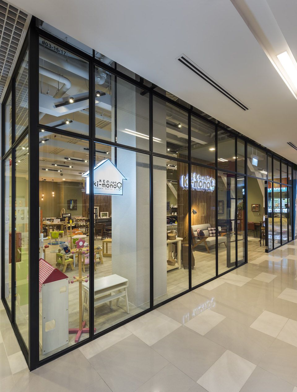
The black framed glass references traditional Japanese screen door frames, and defines the shopfront.
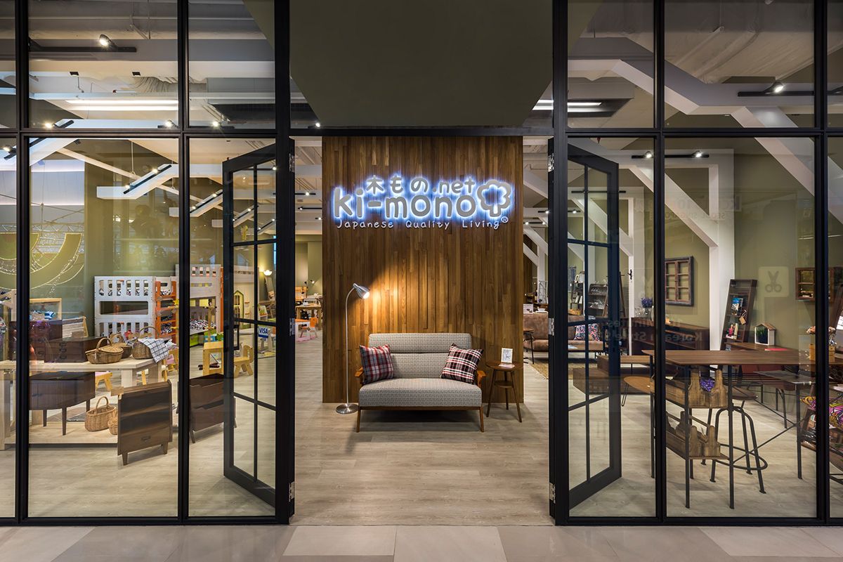
One main entrance was created with double doors in the center of the shop front, leading the customer to the full height, timber focal point wall, where promotions and new designs can be showcased. Thereafter, the customer is led through the space, to view the full range of Ki-Mono products in room settings as one would use in their homes.
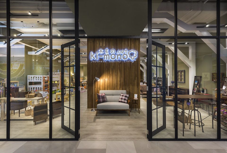
The main doors with the timber feature wall, providing an eye-catching, welcoming entrance.

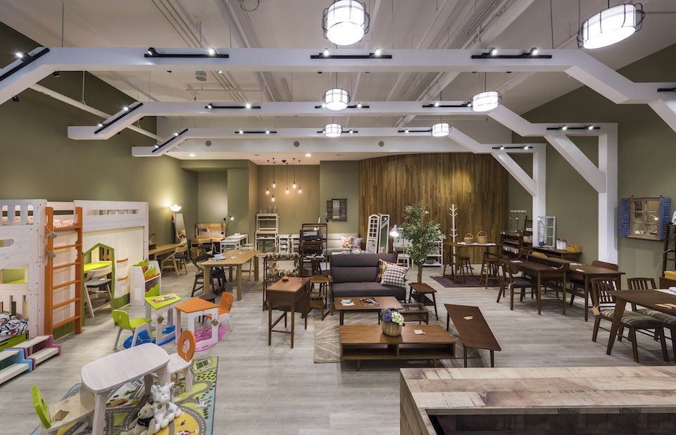
The White support beams and the natural colour palette were carefully considered to add to the character of the space.
Once the perimeter of the shop had been defined, the designers turned their focus on the interior. Using a natural colour palette of muted greens and pale timber, it served to enhance the natural materials used in Ki-mono’s products. Large white timber support beams were added along the walls, which mimics the structures in a traditional Japanese house, reinforcing the heritage of the brand. In addition, the lighting of the shop was carefully controlled to clearly showcase the products to create a bright fresh space. The combined result is a warm inviting store, with a strong feel of Zen, which catches the attention from the outside, drawing the customer in to discover more.
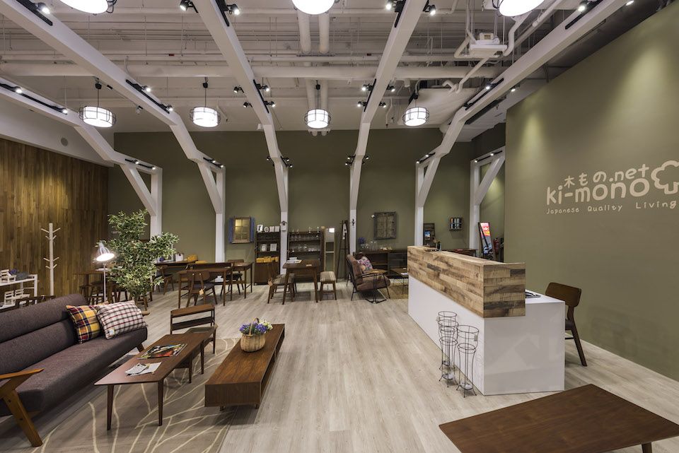
The furniture items shown in room setting create a relatable and comfortable space for the customers.
The creative use of lighting defines specific areas of interest as warm focal points.
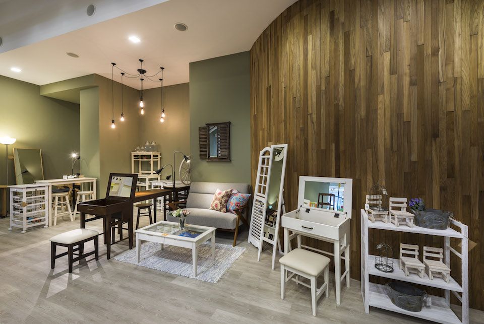
The natural palette provides the perfect backdrop to showcase the products, while the white ceiling creates a sense of space.