Pantone, the company best known for its design colour matching system, has been announcing a colour of the year ever since 2000. The selection is made during a secret meeting of various colour standard group representatives. After two days of presentations and deliberations, the colour of the year is selected.
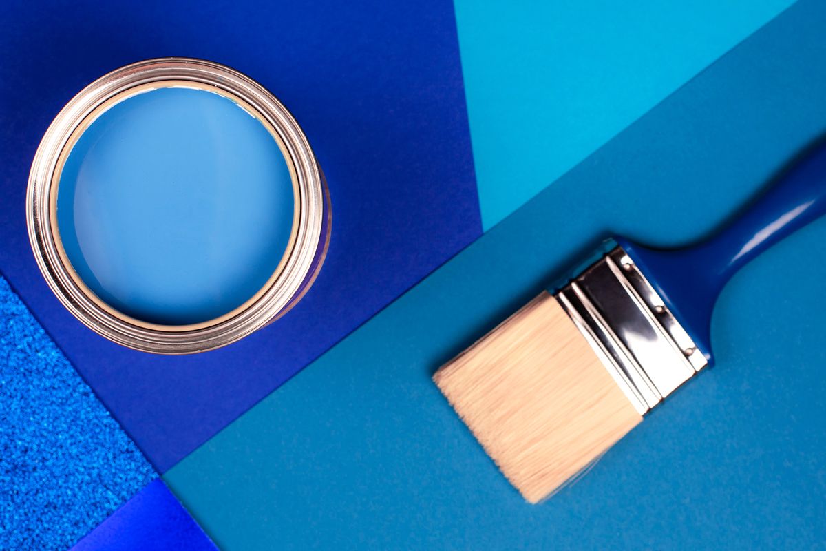
In 2020, classic blue (19-4052) came out as the winner.
Many rejoiced after finding out the selection because classic blue is timeless, beautiful and incredibly versatile. It has extensive application in the interior design world, whether it comes to residential or commercial projects. In addition, classic blue looks rich and sophisticated.
So, would you like to get inspired by classic blue and incorporate it in a remodelling or a re-decoration you’re carrying out? We, as a well-established Singapore home interior design company, share your excitement and have some suggestions for the best utilisation of classic blue. Let’s get started.
Create an Eye-Catching Blue Accent
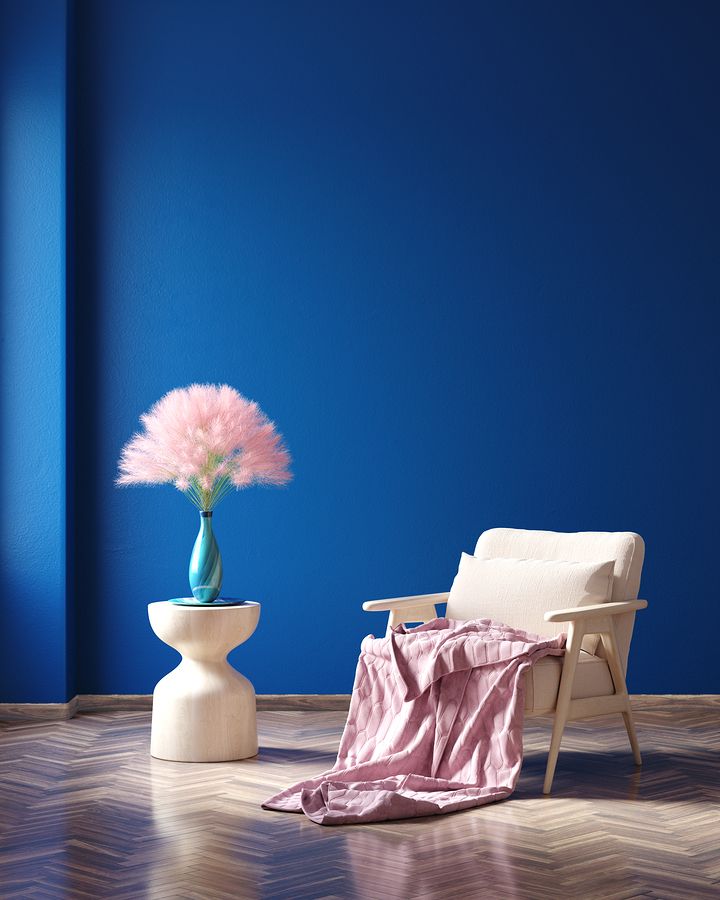
Classic blue is saturated and noticeable. As such, the colour is an ideal choice for an accent element in an otherwise neutral interior design execution.
Painting one wall in classic blue while keeping the others light will immediately result in a beautiful focal point. The rule holds true for both home and office spaces. if you don’t feel like painting, a classic blue piece of furniture will be enough of a design statement.
You can have a large upholstered sofa in that deep, recognisable shade. Alternatively, go for a massive classic blue carpet. You can position that in the centre of the room, organising all of the elements in accordance. Because of its richness, the colour will be the one that will get noticed first. Hence, refrain from using other flashy elements that may compete for attention.
What does a standard bathroom look like?
There are several colours that are typical for the space because they ensure a pristine appearance and ease of maintenance.
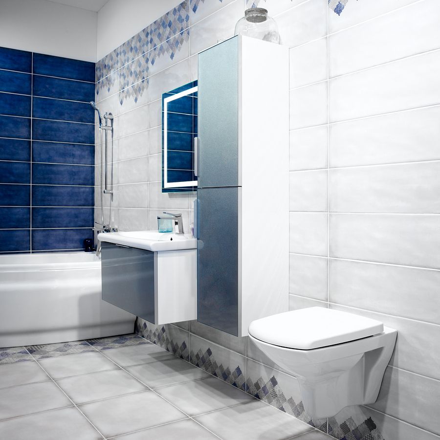
Typically, bathrooms are white, beige, light blue or cream. In such spaces, a classic blue accent will serve as a beautiful element that will brighten up and immediately transform the entire space.
The bathroom cabinet doors, for example, are the ones that you can paint in classic blue. The same applies to the vanity. Don’t overdo it and choose one or two elements to colour. Also, take a look at our article on bathroom trends of 2019.
Blue-Painted Wooden Elements
Wood is a material that can be transformed effortlessly. While it has a classic, natural appeal, painting wood can result in a very interesting, modern vibe.
Imagine having the entire bookshelf in the living room in classic blue. Wouldn’t that be stunning? Placing that classic blue bookshelf in a room that’s more on the light pastel side will quickly add a degree of drama and notable appeal.
You can have classic blue shutters on windows. If a room has a big number of windows or they’re large enough, the shutters themselves will start acting as statement pieces.
The best aspect of such interior design projects and modifications is that they’re easy to complete and you need a minimal budget to get a highly impactful outcome.
Make Use of the Smell, Sound and Taste of Classic Blue
This year, Pantone decided to switch things up a bit. Apart from announcing the colour of the year, the company actually worked on an entire package that is supposed to explain classic blue even better. The package highlights the smell, sound and even the taste of the colour of the year.
These elements can be incorporated in an interior design project to add more dimension to the tone.
Pantone’s package features a rich, suede fabric as an example of what classic blue feels like. There’s also a musk and sea salt scented candle and an audio track called Vivid Nostalgia that’s supposed to present the sound of classic blue.
You can play with these elements as they have a wide range of application in the realm of interior design. The overall tone is serene and ocean-inspired. A focus on tranquility and the unspoiled deepness of the tone will be sufficient to create a little oasis in the urban jungle.
Turn an Entire Room Classic Blue
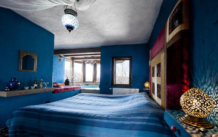
If you’re feeling a bit more adventurous and daring, you can opt for a monochromatic interior design execution that pays homage to classic blue.
Having an entire room redecorated to contain solely classic blue elements may seem like a weird choice but the outcome will definitely be impactful and memorable.
You can experiment with such a monochromatic design in the bedroom or the home office, for example. Classic blue has often been called the colour of resilience and honesty. It also promotes a sense of peacefulness because it is the tone of the sky and the ocean.
Carrying out such a project is not an easy task. A lot of colour matching will have to take place. You will also need to think about dimension, texture and ways in which you can make specific design elements pop in the absence of contrast.
Getting a bit of professional assistance may be the right approach for such an endeavour. The Home Guide team will be honoured and thrilled to help you bring your classic blue vision to reality.
We have both the residential and the commercial experience to guide you through a remodelling or a re-decoration. Our projects fall under numerous styles and we’re confident in our ability to work on a wide array of jobs.
Don’t hesitate to check out our office and residential portfolios or get in touch with us right now to make the most of the Pantone colour of the year.
