Are you smack in the middle of your HDB interior design? Feel like you’ll go nuts if you have to pick another tiny detail that’ll ‘make all the difference?’ Freaking out about selecting the colour scheme because ‘what if the navy blue is too much for that teensy bedroom?’
Well don’t worry; it’s not just you. Ever home owner who has ever taken on interior design in Singapore as a venture of their own always goes through this phase. It may feel like choosing the orange Damask wallpaper or the cloudy grey tile may be the most important decisions in the entire world, but it’s always just a fleeting moment. But one must also digress that selecting the colour scheme for your home is an important task. A recent home renovation means that the client is looking at perhaps more than twenty or twenty-five years’ worth of durability – in both function and aesthetics. Therefore, selecting the right colour scheme can make all the difference between ‘timelessly classic’ and ‘fleetingly redundant.’ Here are 5 popular colour schemes you can choose for your HDB interior design!
Paris Green is a very delicate blend of the zippiest of greys and with the lightest hues of green. It’s a colour that emulates a refreshing yet elegant vibe. Since HDB interior design is usually very respectful of space constraints, Paris Green is a colour that can evoke a fresh yet sophisticated look at the same time while looking well in a small space. It’s a Rococo era inspired colour, and beautifully evokes a very classical style edge in any interior design setting.
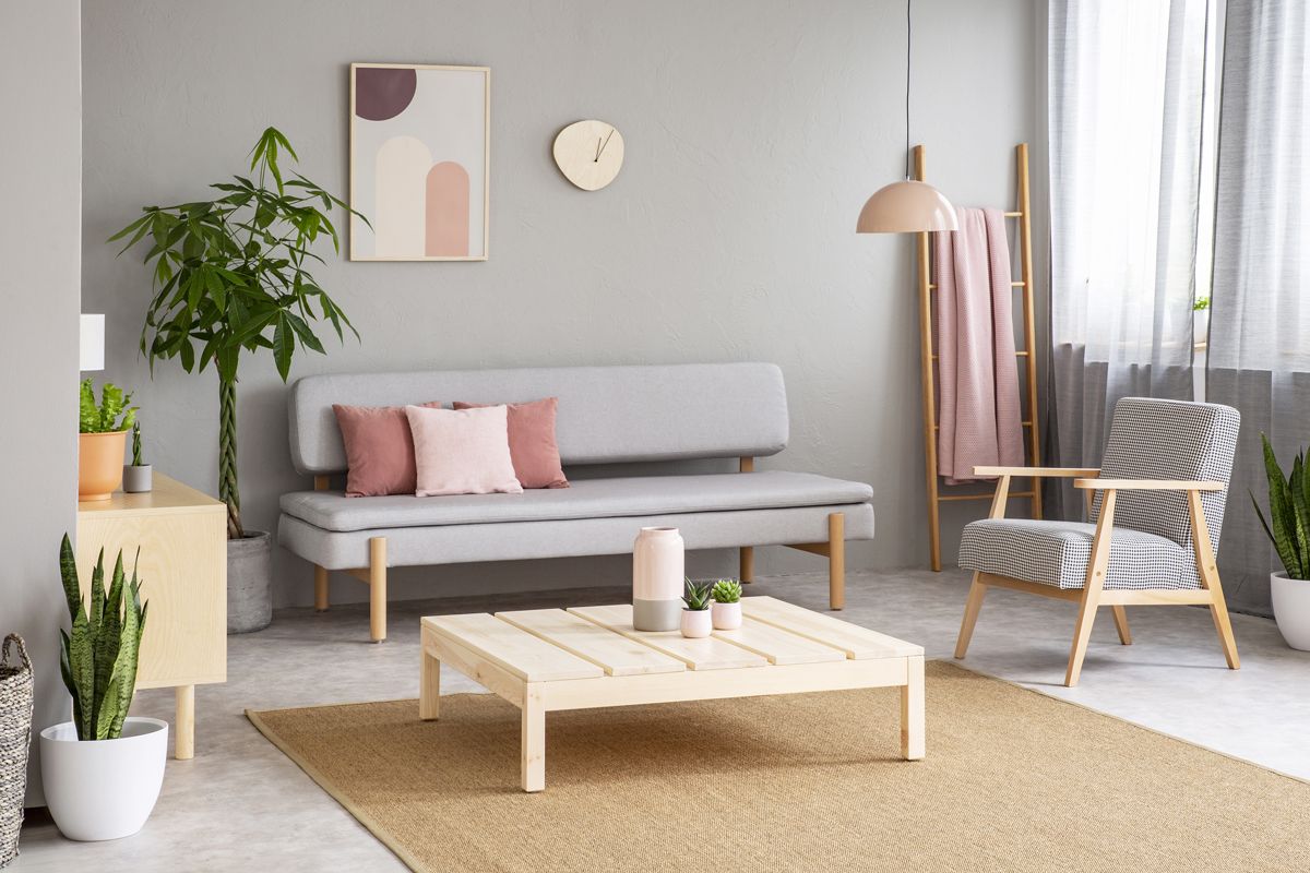
Grey is one of those evergreen, forever classic colour schemes that bring in its very own mini tint-palate to the mix. From the cloudy grey, industrial inspired tones of meter-by-meter tiles to the smooth, plain texture of slate-grey paint, you have an entire shade palate to select from. It may also depend on whatever style of interior design you choose from, but most of the time, it’s all about capturing a certain aesthetic.
Who doesn’t love a good dose of black and white? While it may be the most classic of all, you always have to make sure to tread carefully while balancing out the ratio of black and white in your interior design. Just keep in mind that black colour has a lot of visual weight, and white, in contrast is completely reflective and breezy. Too much of both can seem overkill, so always select carefully.
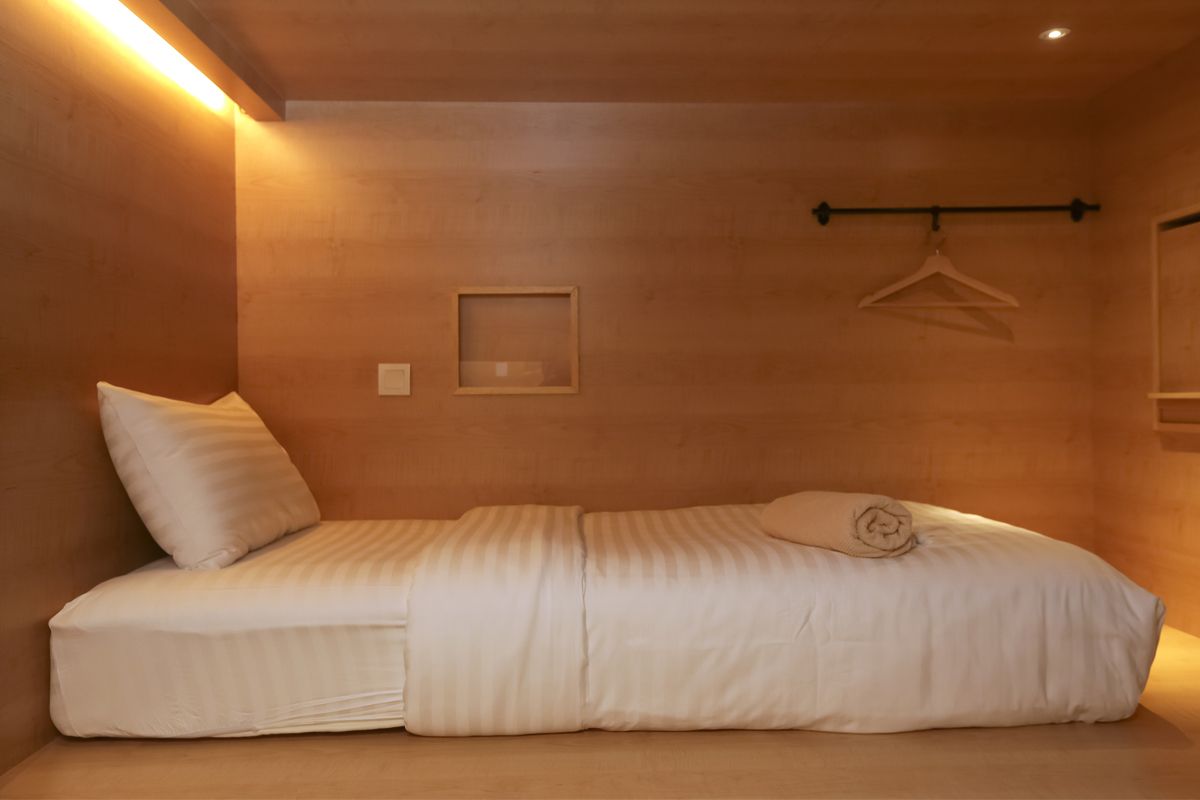
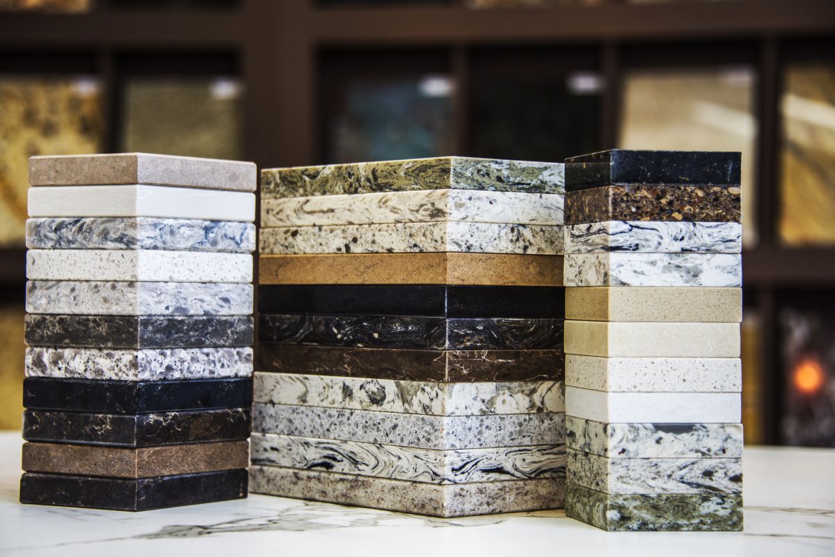
Brown is one of those colours that have an au natural charm. It can effuse a naturally calm aura in any space it embodies. But best of all; brown comes in a multitude of shades, materials, texture and patterns. From the glossy finish of vinyl flooring to the brittle make of hardwood floors and sleek laminates, there is no aesthetic that a nice contemporary brown cannot emulate.
Blue is arguably the most soothing colour on the entire colour wheel spectrum. It has a cool temperature that is extremely relaxing for the human psyche. Choosing any shade of blue for your HDB interior design can make your space look especially tranquil, without compromising on the trendiness.
Of course the selection of the colour scheme is a very personal choice for the home owners. You can select a nice shade of plum and very well contrast it with orange of that’s what you like. We, at Home Guide Designs like to stay on top of the trends, but or designers are always respectful and compromising with the clients wishes and preferences as well.
